March 2022
Hartman Park
We ran across this man-made structure in the marsh, but it the red complemented the underbrush and wintered grass perfectly. I love how the grass is growing on and retaking it.
Open Door
February 23, 2022
Brockway-Hawthorne Preserve
A stone wall draped in moss and lichens provides green contrast to the winter forest; its fallen central boulder invites exploration.
Boundaries
January 16, 2022
Banningwood Preserve
Roaring Brook is iced over, creating frosty boundaries at its shoreline and around a mid-stream boulder.
Winter on the Eightmile
February 2, 2022
Pleasant Valley Preserve
A curve of the Wild and Scenic Eightmile River captures stillness and motion left behind by a winter storm.
Using Line, Scale, and Foreground to Create a Sense of Three-Dimensional Depth
In the Light Challenge, we talked about developing a sensitivity to light and how to use it to express your feelings about a scene. Vibrant, moody, dark, foreboding, lush, are all words that that can be applied to images that have utilized different lighting styles. Let’s now talk about using compositional elements to give a sense of depth.
We are so used to taking pictures, but we don’t often think that what we are doing is actually taking a three-dimensional experience and transposing it onto a two-dimensional surface. This is not necessarily an easy thing to do. There are techniques to help create the illusion that the flat picture plane is actually a three-dimensional space. For centuries painters have dealt with these issues and developed some fabulous techniques.
Line to Create Perspective and Give a Sense of Depth
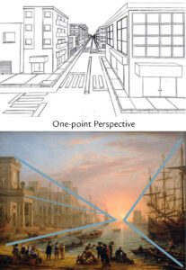
As painters in the 14th – 16th centuries experimented to find ways to make their paintings appear more realistic, they developed techniques called one- and two-point perspective to make the paintings appear as the eyes observe a scene. To a great extent this happens automatically when taking a photograph. However, understanding these visual principles can help the photographer create even more dramatic images. Sometimes it is a matter of moving a few inches or feet in a certain direction.
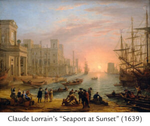 In Claude Lorrain’s “Seaport at Sunset” (1639) he used one-point perspective on the architecture and scale of people and objects, as highlighted with blue lines in the example picture and further illustrated in the line drawing, to lead the eye back into the distance. Although, this happens naturally in a photograph, one can accentuate the effect by proper positioning of the camera.
Foreground and Scale.
Other elements at work in this painting are they use of a foreground and scale. The people in the foreground are larger and give a sense of something near to the viewer that can be looked beyond to a middle ground of row boats and finally to a background of a ship and buildings diminishing in size as they flow off in the distance. Note here the use of light emanating from the back, casting shadows on all things including the building’s pillars, which give a tremendous sense of depth. The foreground people are almost in silhouette reducing their importance and allowing the viewer to explore detail deeper into the picture plane.
OK, so how does this work in a photograph?
Take a look at the examples below and decide for yourself. In my photo of Boat in a Bermuda Race, I have an obvious foreground and a not so obvious foreground. The obvious foreground is simply the railing of the boat and lifelines as they come back towards the camera. The not so obvious foreground are the splashes on the lens which give a tactile sense of water actually coming toward the viewer. Perspective is introduced as the elements of the boat get smaller; the lines of the boat move back into the distance uniting with the boat’s wake as they too move back into the same distant point. The impact is furthered by the line of the horizon and the scale of the small boat in the distance.

In the Selden Creek Sunset photo the lines of the hill converge with the subtle marsh grass and the quiet glow of the channel to invite you to explore the depth of the photo. The marsh plants in the foreground aid in creating a sense of depth.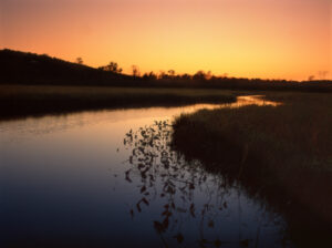
The Maple Tree photo uses the mountain laurel as foreground elements that lead you to the middle ground which is the large maple. The background cove and trees are diminished in size which is accentuated by the mist somewhat disguising their presence.

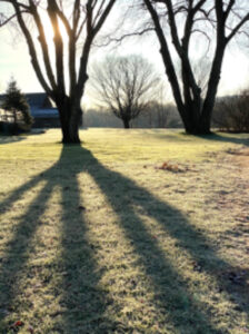
Which compositional elements do you see in use in the photo of Tree with Shadow? Have fun using these techniques when you take photos of scenes in the Lyme Preserves. We look forward to seeing your beautiful submissions expressing a sense of depth.
