While it is good practice to frame the elements in your photo when you take it, it may be desirable to CROP the image later. Cropping means to make a picture frame smaller by cutting off the outer edges of your photo. Often a photo can be improved by identifying the focal areas–the subject of main interest–and arranging the frame to fit around it while removing unwanted elements.

To crop your digital photo, use the editing software that came with your smartphone photo app or use desktop photo editing software such as Photoshop or Photoshop Lightroom.
Look for a tool named “CROP” or look for the Crop icon.
After the crop tool is activated, drag in the edges of the photo to remove areas you don’t want. Play around to get it to look right to you. You can change the feeling of the composition by removing elements you don’t want and by reframing to emphasize important elements.
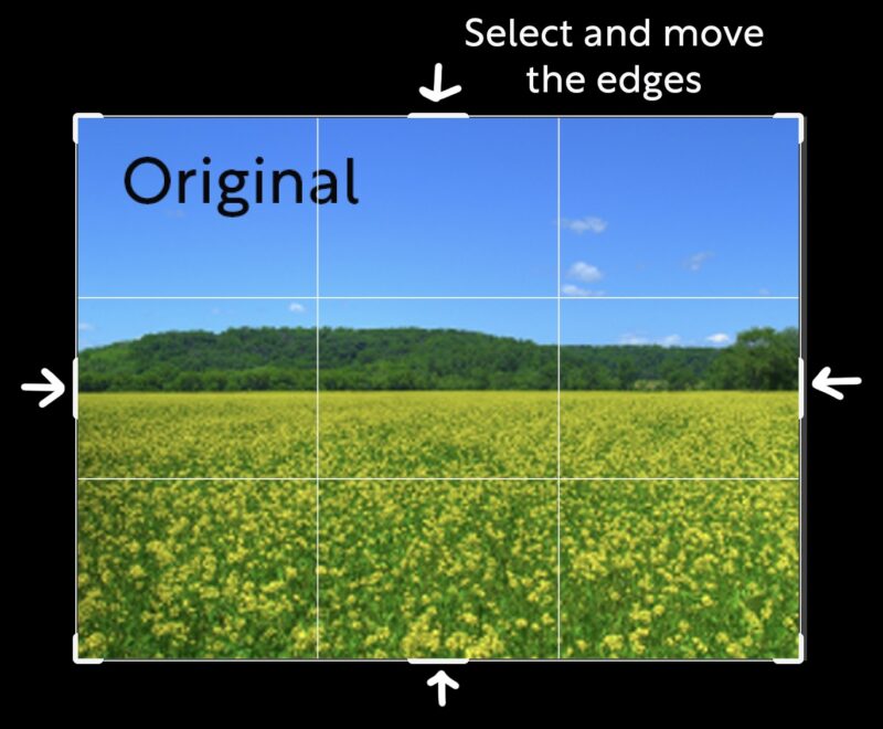
A guideline for creating a dynamic composition is the Rule of Thirds. If you divide your composition into thirds, vertically and horizontally, and then place focal areas of your scene at the meeting points of them (power points), you will get an interesting arrangement of elements in your photo. When using the crop tool, most photo editing apps will automatically provide grid lines that represent the Rule of Thirds.The guidelines are visible only when the cropping tool is activated, They will not show in the final image. Play around with the crop tool, creating different compositions until you find one that expresses your mood.
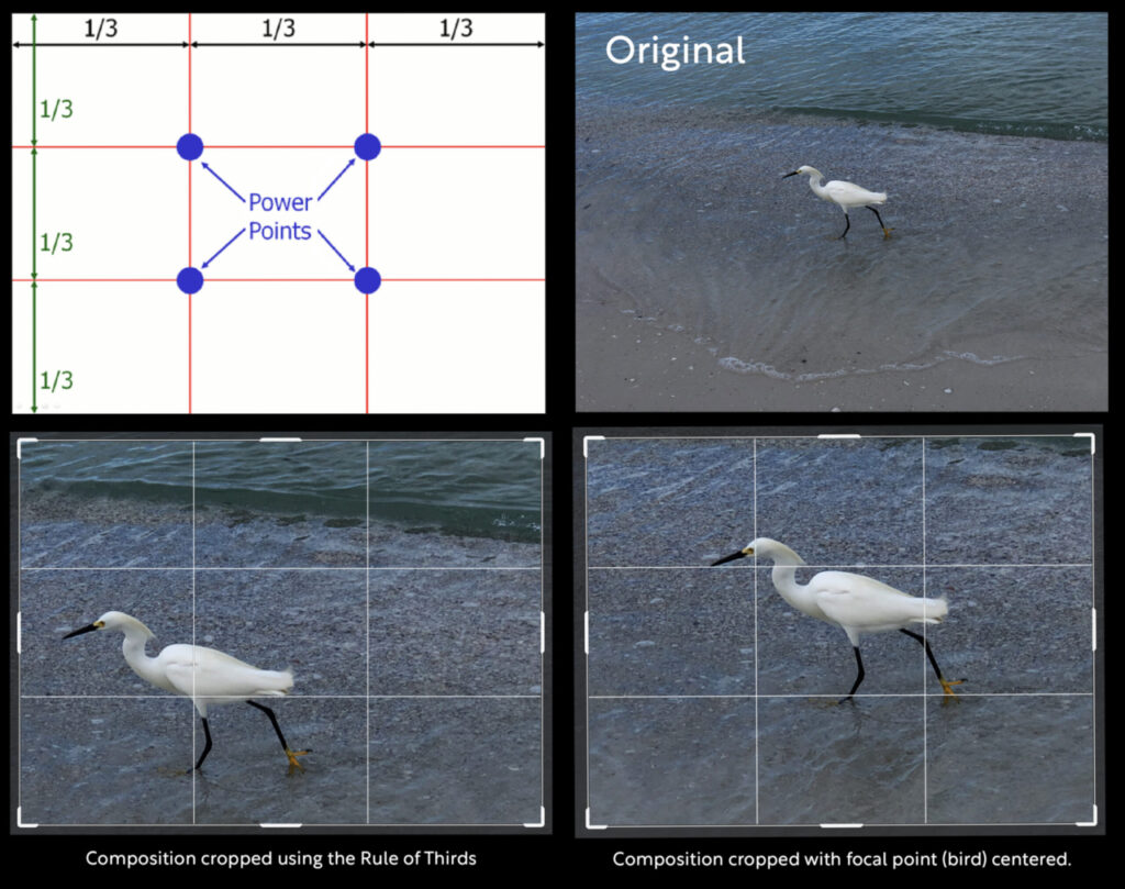
Note the photo of a snowy egret on a beach. In the original, the bird, which is the main focal point, is centered with a lot of undistinguished space around it. Cropping can be used to improve the composition. In the lower left composition, using the rule of thirds, the bird is placed on one of the power points. The off-center placement gives the viewer a sense that the bird is on the move and also brings out a second focal point – the crest of a wave – which balances the composition and creates a dynamic relationship between the elements, with a strong sense of depth. The viewer is drawn into the story of the photo and feels a sense of energy. In the lower right, the composition is cropped to center the bird with no regard to the Rule of Thirds. The background is flat with has little to draw the eye. With almost equal space on all sides, the feeling of movement is minimal. Which composition do you feel is more appealing?
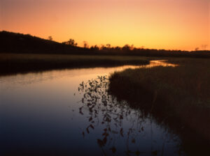
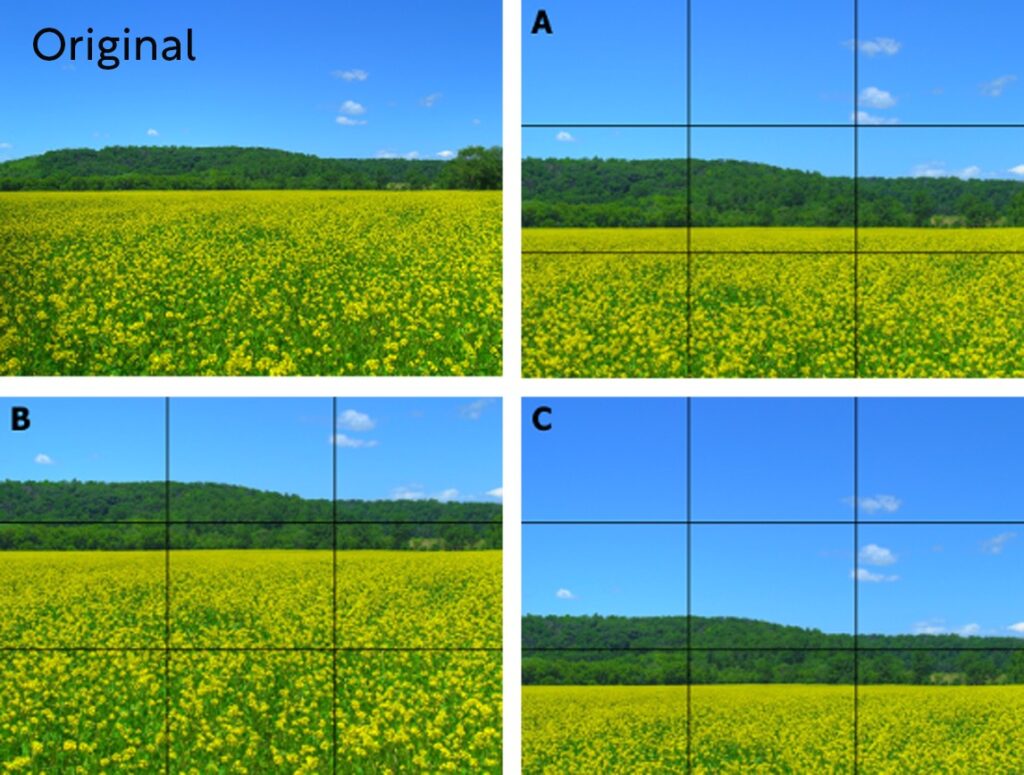
For landscapes, use the Rule of Thirds to decide on a desirable placement of the horizon line. In the example below, we show three cropping choices for the same landscape. In A, the horizon is near the middle of the frame, and the foreground and background are divided equally. Neither element dominates and the composition is fairly static. More dramatic compositions are created in B and C using the Rule of Thirds to place the horizon line to emphasize the foreground or the background. In B, with the horizon line in the upper third, you get a sense of expansiveness in the foreground. The texture is emphasized and one feels a sense of depth as the size of the yellow flower clumps recedes towards the horizon. In C, with horizon line in the lower third, the wide open calm of the blue sky dominates. The arrangement of your composition should reflect the mood or story you wish to express. Which composition do you prefer?
To learn more about composition and the rule of thirds, watch the video of the presentation by photographer Caryn B Davis. Caryn’s presentation starts at at 9:17 minutes.
When you crop, you can restrain the outside edges to a standard aspect ratio if the output will be a print. Most smart phone images require cropping to fit a standard print size. Set the aspect ratio to 2:3 for a 4×6, and 5:7 for a 5×7, and 4:5 for an 8×10.
Click here for a helpful tutorial about cropping images: 6 Tips to Improve Your Photography by Cropping Your Image
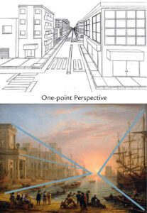
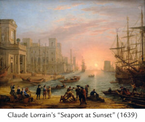 In Claude Lorrain’s “Seaport at Sunset” (1639) he used one-point perspective on the architecture and scale of people and objects, as highlighted with blue lines in the example picture and further illustrated in the line drawing, to lead the eye back into the distance. Although, this happens naturally in a photograph, one can accentuate the effect by proper positioning of the camera.